
Nasa Global Temperature Difference Map 2008-2012
- Thread starter ShintaiDK
- Start date
You are using an out of date browser. It may not display this or other websites correctly.
You should upgrade or use an alternative browser.
You should upgrade or use an alternative browser.
- Apr 22, 2012
- 20,378
- 146
- 106
Lets just hope the southpole stays frozen. Then we can settle with some 7 meters searise over time. I doubt a city like Miami for example exist in the year 2100. Its gonna be under water.
For danish people, lets just say the nordic "brotherhood" will come on a trial. Perhaps we can get Norway back")
For danish people, lets just say the nordic "brotherhood" will come on a trial. Perhaps we can get Norway back
Olikan
Platinum Member
- Sep 23, 2011
- 2,023
- 275
- 126
Once the pole melts and 1/3 to 2/5 of the population is gone, global warming will be instantly corrected. The Earth knows how to balance itself buddy.
instantly balanced!
it will take years for the carbon get "trapped" again
Jaskalas
Lifer
- Jun 23, 2004
- 35,940
- 10,277
- 136

PricklyPete
Lifer
- Sep 17, 2002
- 14,582
- 162
- 106
So my property in Denver will increase in value?
Do you think the oxygenation of the air there will go up once the sea level is higher? Lots of people with that sickle cell trait can't live in Denver.
Jaskalas
Lifer
- Jun 23, 2004
- 35,940
- 10,277
- 136
Nasa Global Temperature Difference Map 2008-2012

If I had to guess, your map OP, would be the average of 2008 through 2012 compared to the 1960-1990 climatology. It still doesn't make sense with a 132 year difference of only 0.7C, but that's the best I can summarize for how such a propaganda map was crafted.
Frankly it doesn't make sense at all.
nehalem256
Lifer
- Apr 13, 2012
- 15,669
- 8
- 0
Do you think the oxygenation of the air there will go up once the sea level is higher? Lots of people with that sickle cell trait can't live in Denver.
I would imagine yes. If water levels rise then the air that the water displaces has to go somewhere.
Olikan
Platinum Member
- Sep 23, 2011
- 2,023
- 275
- 126
If I had to guess, your map OP, would be the average of 2008 through 2012 compared to the 1960-1990 climatology. It still doesn't make sense with a 132 year difference of only 0.7C, but that's the best I can summarize for how such a propaganda map was crafted.
Frankly it doesn't make sense at all.
that link, actually proves that the temperature went up

dank69
Lifer
- Oct 6, 2009
- 37,449
- 33,153
- 136
I think it is pretty conclusive evidence that global warming is Obama's fault.the range of 2008-2012 is nothing, its like analyzing where the some decades old stock is going based on 5 seconds of trade data
Doc Savage Fan
Lifer
- Nov 30, 2006
- 15,456
- 389
- 121
Without context...this graph is meaningless. Link please.
Last edited:
zsdersw
Lifer
- Oct 29, 2003
- 10,505
- 2
- 0
I think it is pretty conclusive evidence that global warming is Obama's fault.
Everything that ever was and ever will be wrong with America and the world is Obama's fault.
Doc Savage Fan
Lifer
- Nov 30, 2006
- 15,456
- 389
- 121
Does this mean that the statute of limitations has finally run out for blaming Bush for everything wrong with America and the world?Everything that ever was and ever will be wrong with America and the world is Obama's fault.
zsdersw
Lifer
- Oct 29, 2003
- 10,505
- 2
- 0
Does this mean that the statute of limitations has finally run out for blaming Bush for everything wrong with America and the world?
Yes, but you'd be just as stupid for blaming everything on Obama as they were for blaming everything on Bush.
Doc Savage Fan
Lifer
- Nov 30, 2006
- 15,456
- 389
- 121
You and dank69 apparently have a lot in common it seems.Yes, but you'd be just as stupid for blaming everything on Obama as they were for blaming everything on Bush.
zsdersw
Lifer
- Oct 29, 2003
- 10,505
- 2
- 0
You and dank69 apparently have a lot in common it seems.
No more than you and spidey07 do.
- Apr 22, 2012
- 20,378
- 146
- 106
If I had to guess, your map OP, would be the average of 2008 through 2012 compared to the 1960-1990 climatology. It still doesn't make sense with a 132 year difference of only 0.7C, but that's the best I can summarize for how such a propaganda map was crafted.
Frankly it doesn't make sense at all.
The "propaganda" map...
Image Credit: NASA Goddard Institute for Space Studies.
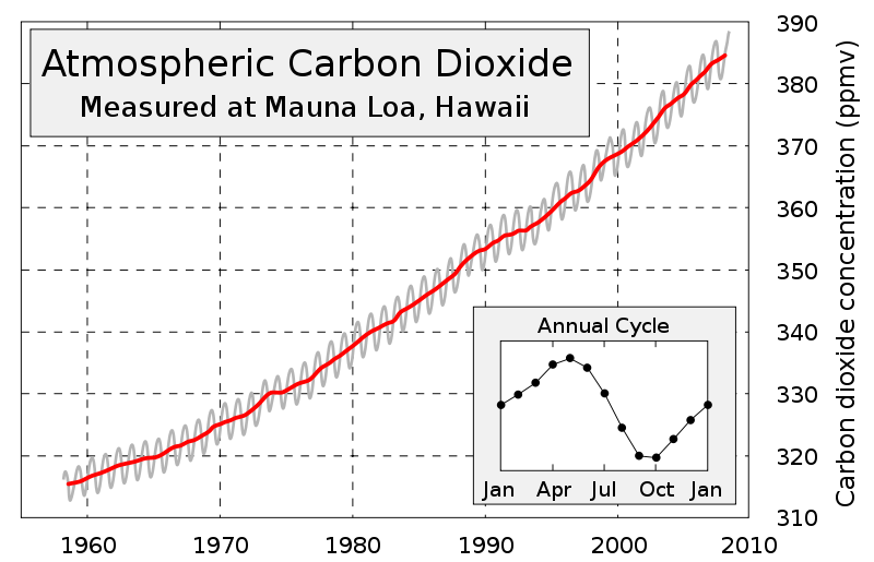
In 1880 is CO2 level was 285ppm. In 1960 it was 315ppm and now its 390ppm.
Last edited:
sm625
Diamond Member
- May 6, 2011
- 8,172
- 137
- 106
2008 to 2012 is almost exactly the trough to current peak of solar cycle 24. They're gonna keep pumping this crap out until cycle #24 peaks and than all this crap will stop. Notice how they dont post charts comparing 2004 with 2008, the peak-to-trough of solar cycle 23. If they did they would have people thinking we was heading right into an ice age.
Where is the common sense amongst people anymore?
TLDR: We're in "late May" of solar cycle 24. 2008 was "January". 2008-2012 is "January to May". Yes it got warmer from january to may. Wow that is intense.
Where is the common sense amongst people anymore?
TLDR: We're in "late May" of solar cycle 24. 2008 was "January". 2008-2012 is "January to May". Yes it got warmer from january to may. Wow that is intense.
Last edited:
Doc Savage Fan
Lifer
- Nov 30, 2006
- 15,456
- 389
- 121
Do you understand the concept of "cherry picking"? Do you understand that temperature fluctuation over a 5 year interval is meaningless?The "propaganda" map...
Image Credit: NASA Goddard Institute for Space Studies.
I'm starting to worry about you.
Last edited:
Triumph
Lifer
- Oct 9, 1999
- 15,031
- 14
- 81
If CO2 is the cause, then just plant more trees. A LOT more. That's fine with me, there's plenty of room for it and trees are pretty. Let's go, hurry up.
Also, stop off shoring all of our jobs to places in the 3rd world that don't have emissions controls. We keep er jerbs, and they don't get to pollute. Win/win.
Also, stop off shoring all of our jobs to places in the 3rd world that don't have emissions controls. We keep er jerbs, and they don't get to pollute. Win/win.
TRENDING THREADS
-
 Discussion Zen 5 Speculation (EPYC Turin and Strix Point/Granite Ridge - Ryzen 9000)
- Started by DisEnchantment
- Replies: 25K
-
Discussion Intel Meteor, Arrow, Lunar & Panther Lakes + WCL Discussion Threads
- Started by Tigerick
- Replies: 23K
-
 Discussion Intel current and future Lakes & Rapids thread
- Started by TheF34RChannel
- Replies: 23K
-

-

AnandTech is part of Future plc, an international media group and leading digital publisher. Visit our corporate site.
© Future Publishing Limited Quay House, The Ambury, Bath BA1 1UA. All rights reserved. England and Wales company registration number 2008885.