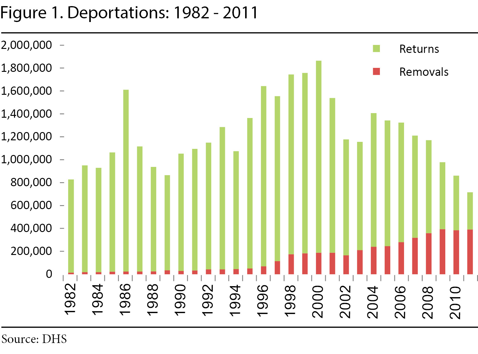
Did you read that article? Look at the clever word-play. In graphs (including the one posted above), the 1.8 million is defined as deportations, but it is actually only removals.
Look at the graph posted by HomerJS, notice the total of 419,000 in 2012? Now look at the first graph in your article. Notice the redline peaks just above 400,000? Now look at the graph called "Locked Out" in your article, notice the total for removals is a little bit below 500,000? There you have it, what is being called a "deportation" is actually just a removal, where total deportations should be removals + returns.
Now, look at the Locked Out graph again, notice returns are declining faster than removals are increasing? That shows us that total deportations are declining under Obama, but they claim there is an increase by focusing only on removals and calling that total deportations.
In case the above is confusing, here's an easier graph to understand, courtesy of the Department of Homeland Security:

As you can see, Obama is much worse at total deportations than Bush, who was worse than Clinton.