-
We’re currently investigating an issue related to the forum theme and styling that is impacting page layout and visual formatting. The problem has been identified, and we are actively working on a resolution. There is no impact to user data or functionality, this is strictly a front-end display issue. We’ll post an update once the fix has been deployed. Thanks for your patience while we get this sorted.
You are using an out of date browser. It may not display this or other websites correctly.
You should upgrade or use an alternative browser.
You should upgrade or use an alternative browser.
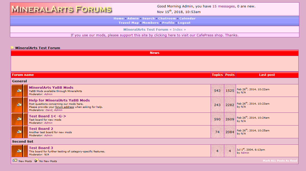
Do you like the new forum style?
- Thread starter brainhulk
- Start date
-
- Tags
- 0.99999999999 tags = 1 ajay is a lesser being ajay is cooler than highland ajay's tag is here brainhulk pome hide your money because highland145 was here i'm pretty sure no one notices these anymore let's see how many tags we can cram here ok two of us are paying attention these tags bro. tags are out of hand tickle me highland is this year's hottest toy yes highland this is sdifox's tag your source of bulk tags online zin gonna be tagged and bagged
highland145
Lifer
So did some one say WHY?
highland145
Lifer
Even he would disagree.Fucking tribute to the Orangutan in Chief
PottedMeat
Lifer
not really
my eyes were burned out (again)
my eyes were burned out (again)
fleshconsumed
Diamond Member
No.
Huge toolbar on the left and too much wasted space on the page all around. At least I can turn off the toolbar on the right. New site also does not play nice on FF with ABP and NoScript.
Seems like the new AT owners really want everybody to leave. There aren't that many of us left here.
Clicked on settings and got 503 timeout.
Any way to change the theme back to dark at least?
sdifox
No Lifer
No.
Huge toolbar on the left and too much wasted space on the page all around. At least I can turn off the toolbar on the right. New site also does not play nice on FF with ABP and NoScript.
Seems like the new AT owners really want everybody to leave. There aren't that many of us left here.
Clicked on settings and got 503 timeout.
Any way to change the theme back to dark at least?
I was able to use dark, so at least there is a lot less orange. Replying in landscape mode is still messed up. I cannot see the edit window because of persisitent banner.
lxskllr
No Lifer
You can turn off the left sidebar with the hamburger menu. Go to setting to switch to dark theme. Dark theme has the strange combination of being in your face, while still having low contrast making it hard to see different elements. I'm a big fan of low contrast, but not the way it's done here.No.
Huge toolbar on the left and too much wasted space on the page all around. At least I can turn off the toolbar on the right. New site also does not play nice on FF with ABP and NoScript.
Seems like the new AT owners really want everybody to leave. There aren't that many of us left here.
Clicked on settings and got 503 timeout.
Any way to change the theme back to dark at least?
Insomniator
Diamond Member
Why can't they just offer a skin that matches what we've seen and liked for ~15 years?
Staying off this site until I can read the thread titles again at least.
Staying off this site until I can read the thread titles again at least.
IronWing
No Lifer
So Red Squirrel picked it?I don't, orange clashes with my butt hair...
fleshconsumed
Diamond Member
Thanks guys, turned off left side bar and switched to dark mode. A lot more palatable now, but good god, the orange thread titles look frigging horrible with dark theme.
dainthomas
Lifer
This is the Iron Man 3 of forum styles.
BurnItDwn
Lifer
Can we get a Windows 3.x era "Hot dog stand" theme? It would be good.
Sample is here for any young folks who may not have lived through those dark old days.
https://blog.codinghorror.com/a-tribute-to-the-windows-31-hot-dog-stand-color-scheme/
Sample is here for any young folks who may not have lived through those dark old days.
https://blog.codinghorror.com/a-tribute-to-the-windows-31-hot-dog-stand-color-scheme/
TRENDING THREADS
-
 Discussion Zen 5 Speculation (EPYC Turin and Strix Point/Granite Ridge - Ryzen 9000)
- Started by DisEnchantment
- Replies: 25K
-
Discussion Intel Meteor, Arrow, Lunar & Panther Lakes + WCL Discussion Threads
- Started by Tigerick
- Replies: 25K
-

-

-
