mikeymikec
Lifer
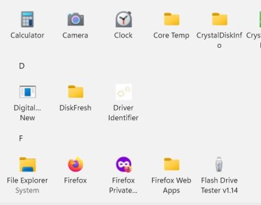
The lower half of the list, the 'all apps' list:


good lord that looks like shit, why?
it makes sense on a small phone screen....but your right...and i hate it..thankfully there's many ways to get rid of thatSee the second image 🙂
Honestly and in fully seriousness though, I'm pretty sure that's the reason why. MS has been imitating Apple for a while now.
How does the search work? There's some very minimalist android launchers that are text based. You start typing, and suggestions popup right away. Iit's pretty easy selecting the right program. I'm dubious about requiring keyboard use on a phone, but I see the appeal. Does windows search work well?
thankfully there's many ways to get rid of that
See the second image 🙂
Honestly and in fully seriousness though, I'm pretty sure that's the reason why. MS has been very poorly imitating Apple for a while now.
Imitating poorly is one problem but the other problem is Microsoft puts ads and service upsells in the start menu regardless.There, I fixed that for you. 😉
Imitating poorly is one problem but the other problem is Microsoft puts ads and service upsells in the start menu regardless.
Sadly, Apple actually copied a bit from Microsoft. For iDrive notices in settings and unending update notifications for Tahoe.
I suspect they're converging on maximally garbage user interfaces based on telemetry and service sells.
I suspect they're converging on maximally garbage user interfaces based on telemetry and service sells.
The grid view isn't too bad. It uses the screen space better, and at least it's still in alphabetical order, so faster to find what you need if you know the name of the app you're seeking.The main way I can think of is to install a third party Start menu app. Admittedly the all apps list can be altered in its formatting but they clearly didn't think about what would best utilise the available space (e.g. the list view leaves a tonne of space next to a single column view).
The grid view isn't too bad. It uses the screen space better, and at least it's still in alphabetical order, so faster to find what you need if you know the name of the app you're seeking.
On My computer, the grid view DOES have icons. Not for everything, but most of the items do have it. Maybe there is a setting to enable them?It makes the whole format counter-intuitive / work against itself: Surely the point of the 'all apps' list is for the user to find an app that they don't use very often (so therefore icons + labels are far more helpful), yet the apps that the user has pinned to the Start menu has labels (even though the user is a lot more likely to know the icon art for their pinned items).
Furthermore, I like to think that I know every app that comes with Windows, but rather like me occasionally deciding to deep-clean my keyboard and removing every key in order to clean all the nooks and crannies, and I'd like to think that I know where they all go without thinking, I take a picture of the intact keyboard first because I know from experience that I'm not as familiar as I'd like to think (and yes I do touch-type), and that's just aside from the fact that Microsoft has been helpfully "updating" icon art lately. Yes, one can hover the pointer over each icon for a second to get a tooltip, but imagine how much longer that would take to find the app one is looking for vs. having labels! After ten hovers I'd bet the user would give up and find some other way.
On My computer, the grid view DOES have icons. Not for everything, but most of the items do have it. Maybe there is a setting to enable them?
It has both labels AND icon (pictures). For most of the items, not all.Do you mean labels? Icons are pictures.
It has both labels AND icon (pictures). For most of the items, not all.
Same in list view.
In category view, there are only icons, but if you mouse over them, you see the text labels.
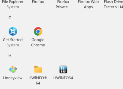
Here is what it looks like in grid view:
If you switch it out of category view (the default setting), sure.
If you switch it out of category view (the default setting), sure.
/shrug, the windows 11 start menu has been pretty much useless since inception. This finally adds some nice features to it. I like it.