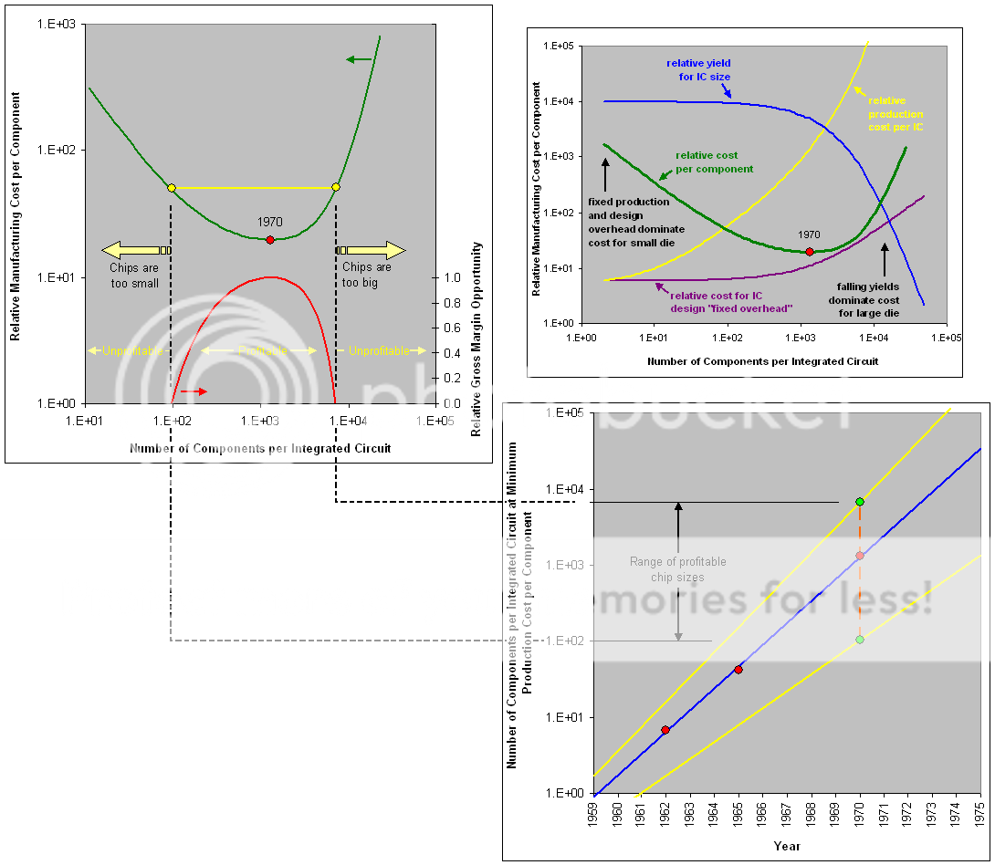
Why does the relative manufacturing cost per component increase as you move to the left along the x-axis to the left of the minimum? Why would a small number of components per IC ever cost more than a larger number?
It is a bit of an eye-chart, and I apologize for that, but if you expand the following embedded pic (it is also included in my post above) and interrogate the embedded graph located in the upper-right hand corner you will get an idea of why costs actually increase on a per-component basis for smaller and smaller component-count ICs.
The purple curve is the culprit.
You have a fixed IC design/development cost based on the size of the team and the length of the development timeline that just doesn't scale down all that well.
You can't, for example, hire a part-time silicon validation engineer to be on hand for just the 6 months you need them. You need them to be on your books the entire time so a new-hire coming up to speed doesn't jeopardize the product timeline itself.
Now what is obviously missing, and intentionally so, is the "volume" aspect.
To keep the analysis simple and digestible, Moore chose to normalize the expected shipping volumes of the ICs in question. So if the price/component curve were to represent say 1m units shipped per year then that is assumed for both the 10mm^2 chips as well as the 500mm^2 chips.
So now you get to why companies like Qualcomm and Apple want/need to produce tens of millions, if not hundreds of millions, of little tiny chips at any given node. They amortize the rather expensive (on a per-component basis) development cost for the small IC across those tens of millions of ICs.
And if the volume demand for the chips fails to materialize, ala Nvidia's Tegra situation, then the cost structure explodes (unfavorably so) raising the cost-per-IC to heights that are simply non-viable in a matter of a year or two.