1. I would have use both side of the door frame to frame the shot, increase DOF to take in the entire class with a wide angle, or accentuate the boy in the front with shallow DOF and telephoto to compress the scene while maintain door framing. Fill flash could also be employ to to increase saturation.
2. It is good that you show the destruction of the building behind and the posters in front, but it is hard to know which is the main subject in the shot. Could try shooting more on an angle and show more background building with the front posters are slightly blur to make the building in the background the focal point.
3. The door have potential, but odd framing with brightly lit back ground (random look).
4. Have potential for a good posterization image. I would wait and shoot a few more shots later so that the lights in front of the buildings would have a stronger effect, as well as burn in the center of the street to give it that eire feel.
5. Look like a random picture.
6. High contrast & posterization may work for a stalk look, with more DOF for the entire frame tighter/closer to the foreground tree with telephoto for a compressed look, or back up a bit and an ultrawide shot with high contrast for posterization and low DOF for a stronger focal point. (Try fill flash on the left from bottom makes sure that it doesn't lose the shadow of tree on the ground may enhance the contrast look)
7. Random shot
8. No focal point, street with nothing. Could try re framing and different lens with red car as 1/3 x 1/3 or 1/5 x 1/3 for focal point.
PS. Get books, take more pictures, enroll in photography classes.
Good luck
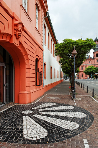
Below is a very nice picture of your. Also, try wider lens if you can retake the image.
Much better shot & framing than the above empty street/trees/cars shot.